There are numerous ways to use SVG files in your web project, and even more so if it's a React project. For ultimate flexibility, I've found the best approach to be creating React components out of the individual SVG files. This allows you to pass in props for added customization and variation of the SVG, promoting reusability of the components. You also get the benefit of an inline SVG in the output markup, creating one less HTTP request from your site.
The outcome of this component is you will be able to create something like this in your code.
<PaperPlaneIcon iconFill="EFEFEF" iconClass="unique-classname"/>You can see how this makes it much easier to reuse this SVG in different applications by just passing a different color in, or a class name in if you're using that class deeper than the wrapper level, or any other attribute you want to apply to the SVG.
1. Simplify the SVG shape (Optional)
This first part is an extra step if you're comfortable editing paths in a program like Sketch or Adobe Illustrator. What you want to do is simplify the shape as much as possible. Depending on the source of the original SVG, there are most likely extra points if it hasn't been optimized already. The usual places to locate extra points are corners or bends in your shape. In this example, I remove the corner point and re-create that shape by extending the handles of the two surrounding points. The least points in your shape, the fewer coordinates there are to include within the SVG code!
2. Reduce the SVG code
Here is the original SVG code of this paper plane icon I'm working with. This is exactly as it was output by Sketch. Next, we'll simplify this by removing unnecessary code as well as code that will interfere with creating a highly flexible icon component.
<?xml version="1.0" encoding="UTF-8"?>
<svg width="24px" height="18px" viewBox="0 0 24 18" version="1.1" xmlns="http://www.w3.org/2000/svg" xmlns:xlink="http://www.w3.org/1999/xlink">
    <!-- Generator: Sketch 50.2 (55047) - http://www.bohemiancoding.com/sketch -->
    <title>Shape</title>
    <desc>Created with Sketch.</desc>
    <defs></defs>
    <g id="Page-1" stroke="none" stroke-width="1" fill="none" fill-rule="evenodd">
        d="M23.9.6c-3.5 5.7-7 11.3-10.4 17-.2.3-.4.4-.7.2L10.1 16c-.2-.1-.3-.1-.4 0L7 17.8c-.1.1-.4.2-.5.1s-.2-.3-.2-.5v-3.5c0-.3.1-.4.3-.6C10.7 10.1 14.9 7 19 3.8c.1-.1.2-.2.3-.2v-.1c-.1 0-.2.1-.3.1-4.9 2.6-9.8 5.3-14.8 7.9-.2.1-.3.1-.5 0-1.1-.8-2.3-1.6-3.4-2.4-.2.1-.3-.1-.3-.2s.2-.3.4-.3c7.7-2.9 15.3-5.7 23-8.5.2-.1.4-.1.5.1.2 0 .1.2 0 .4z" id="Shape" fill="#b490f1" fill-rule="nonzero"></path>
    </g>
</svg>
The first thing I do is remove any part of the code that won't be ported over to the React component version. The XML encoding, title, description tags, empty definitions, and comments. What I end up with is a simpler version of the original code:
<svg width="24px" height="18px" viewBox="0 0 24 18" version="1.1" xmlns="http://www.w3.org/2000/svg" xmlns:xlink="http://www.w3.org/1999/xlink">
    <g id="Page-1" stroke="none" stroke-width="1" fill="none" fill-rule="evenodd">
        <path d="M23.9.6c-3.5 5.7-7 11.3-10.4 17-.2.3-.4.4-.7.2L10.1 16c-.2-.1-.3-.1-.4 0L7 17.8c-.1.1-.4.2-.5.1s-.2-.3-.2-.5v-3.5c0-.3.1-.4.3-.6C10.7 10.1 14.9 7 19 3.8c.1-.1.2-.2.3-.2v-.1c-.1 0-.2.1-.3.1-4.9 2.6-9.8 5.3-14.8 7.9-.2.1-.3.1-.5 0-1.1-.8-2.3-1.6-3.4-2.4-.2.1-.3-.1-.3-.2s.2-.3.4-.3c7.7-2.9 15.3-5.7 23-8.5.2-.1.4-.1.5.1.2 0 .1.2 0 .4z" id="Shape" fill="#b490f1" fill-rule="nonzero"></path>
    </g>
</svg>
Within the SVG tag, there are a couple things I like to remove including the version, xmlns and also getting rid of the width and height values. The viewBox value will constrain the proportions of the SVG and ensure it scales properly. And instead of having the width and height as part of the SVG tag, I instead control it via CSS. If you keep the height and width values and try to scale the SVG with CSS, you'll either run into issues with the image getting clipped or the outer bounding div getting resized, but not the icon itself. I also remove the group or tag around the paths as it doesn't help group or organize anything in this single SVG component.
Since this is JSX we're using in React, remember to change any hyphen properties to camel case. For example, if I was going to keep fill-rule in the SVG code I would need to change it to fillRule in order for it to get parsed correctly in the JSX transform. After those changes I end up with an even simpler SVG file like so:
<svg viewBox="0 0 24 18" xmlns="http://www.w3.org/2000/svg">
    <path fill="#b490f1"
      d="M23.9.6c-3.5 5.7-7 11.3-10.4 17-.2.3-.4.4-.7.2L10.1 16c-.2-.1-.3-.1-.4 0L7 17.8c-.1.1-.4.2-.5.1s-.2-.3-.2-.5v-3.5c0-.3.1-.4.3-.6C10.7 10.1 14.9 7 19 3.8c.1-.1.2-.2.3-.2v-.1c-.1 0-.2.1-.3.1-4.9 2.6-9.8 5.3-14.8 7.9-.2.1-.3.1-.5 0-1.1-.8-2.3-1.6-3.4-2.4-.2.1-.3-.1-.3-.2s.2-.3.4-.3c7.7-2.9 15.3-5.7 23-8.5.2-.1.4-.1.5.1.2 0 .1.2 0 .4z"
    />
  </svg>
3. Create The React Component
From here we're ready to make a React component out of it. This can be made as a stateless functional component, as the only functionality happening within the component is passing the color and class name props. In this example, I only am applying the color to a single path, so I created the fallback color with the fill rule of the path itself. But if this was a color I was applying in multiple areas I would create that fallback higher up in its own const, and pass that new const to the various paths. Something like const iconColor = props.iconFill || '#b490f1' and then use {iconColor} in the paths.
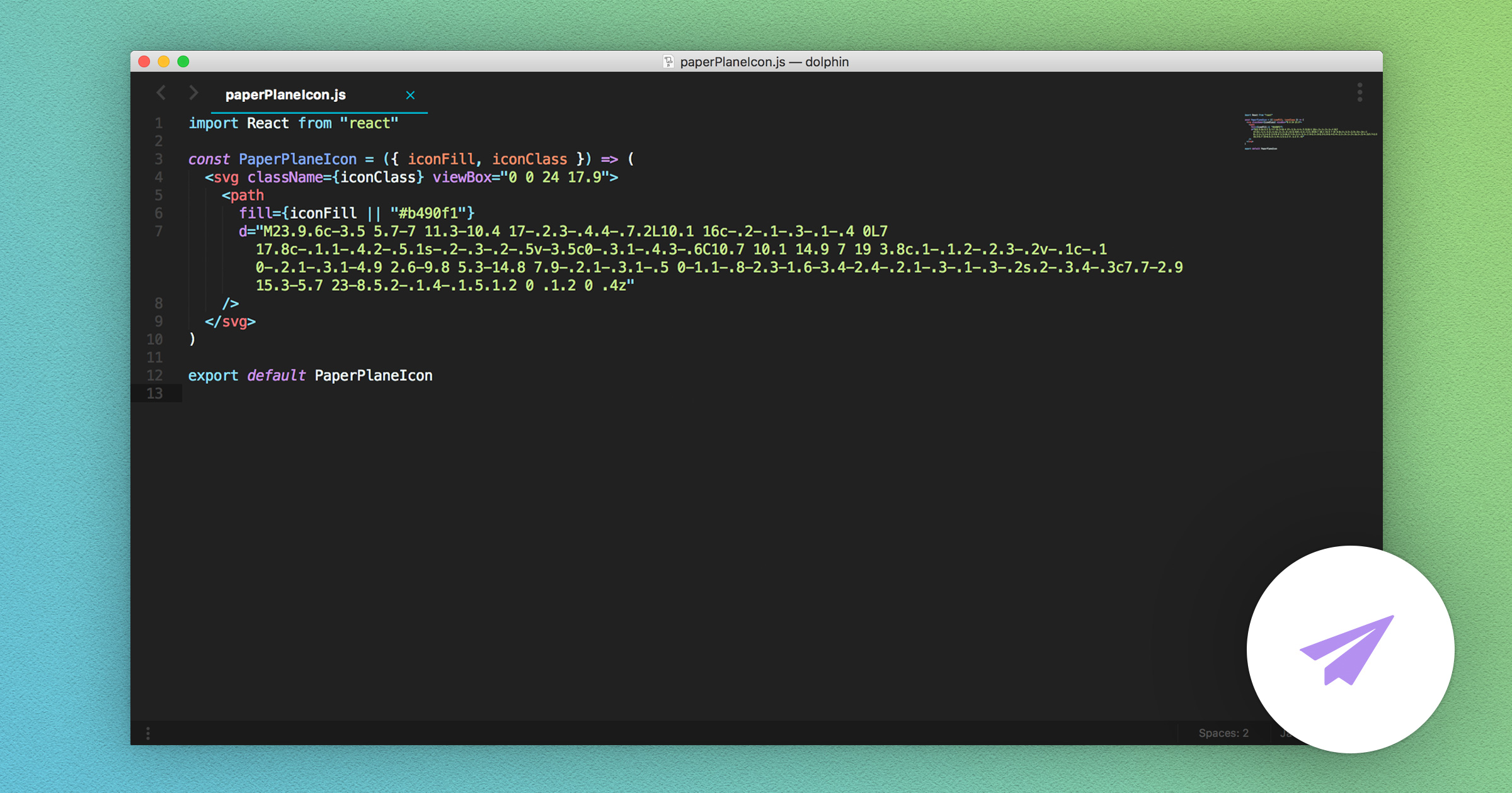
import React from "react"

const PaperPlaneIcon = ({ iconFill, iconClass }) => (
  <svg className={iconClass} viewBox="0 0 24 18" xmlns="http://www.w3.org/2000/svg">
    <path
      fill={iconFill || "#b490f1"}
      d="M23.9.6c-3.5 5.7-7 11.3-10.4 17-.2.3-.4.4-.7.2L10.1 16c-.2-.1-.3-.1-.4 0L7 17.8c-.1.1-.4.2-.5.1s-.2-.3-.2-.5v-3.5c0-.3.1-.4.3-.6C10.7 10.1 14.9 7 19 3.8c.1-.1.2-.2.3-.2v-.1c-.1 0-.2.1-.3.1-4.9 2.6-9.8 5.3-14.8 7.9-.2.1-.3.1-.5 0-1.1-.8-2.3-1.6-3.4-2.4-.2.1-.3-.1-.3-.2s.2-.3.4-.3c7.7-2.9 15.3-5.7 23-8.5.2-.1.4-.1.5.1.2 0 .1.2 0 .4z"
    />
  </svg>
)

export default PaperPlaneIcon
Now you're able to use <PaperPlaneIcon /> wherever you'd like and pass in any color to change the icon color. The power in this is the reusability of the component, as well as the ability to do client-side theming changes, say giving your users the ability to brand parts of your application.
But Wait, There's Another Way!
The workflow above is my process I've been using for a couple years now and it's worked well. Of course, new tools and processes come out to solve workflows like this all the time, and one that's caught my eye recently is https://svgr.now.sh/ by Sweet Code. It provides a slick interface where you can paste your raw SVG code on the left-hand side and get the React component on the right. It provides some configurable options for the output code and does a good job of providing a ready to use component. They also have a CLI which allows for more options such as removing width and height or running on an entire directory. Hopefully, that helps you create your own SVG components and you can see the benefits in doing so!