Whichever way you pronounce favicon, it's probably one of those items on your site checklist which you remember to get to right before you launch your site, or maybe even a little after you launch it. Although a simple concept, there's a lot more to favicons these days than a simple favicon.ico file.
A Little Background
Favicons were introduced in 1999 by Internet Explorer 5. Favicons were originally used in IE's favorites menu next to the URL, an interesting side effect of this was it provided some early insight into the analytics of your site. You could count how many requests you were getting for the favicon.ico file and use that to estimate how many users bookmarked your site. This was before Google Analytics and an early take on engagement metrics. However, it is no longer relevant as most browsers download favicons files to display in tabs. Later in 1999 into 2000 the W3C standardized the favicon and allowed for its flexibility in terms of location on the server and image format, which we see being used today to serve multiple purposes beyond browser tabs.
What You Want To Cover
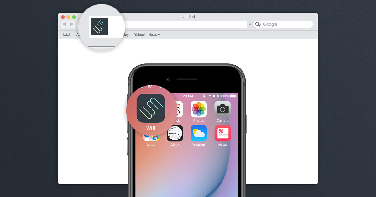
As I mentioned, favicons no longer are just for browser tabs. They are now used on touchbars, icons for sites you save to your mobile device homescreen, desktop shortcuts, and still in tabs and bookmarks. You'll want to cover all these situations as users are experiencing our sites in more ways than ever and it's an easy way to extend your brand to one more user touchpoint.
How To Get It Done
It would be extremely tedious to create all these image assets one by one everytime you need to generate favicons, luckily there's a really convenient site which guides you through the process. I always use https://realfavicongenerator.net/ when I need to make a set of favicons. To get started it's best to use a high res (at least 260 x 260) PNG file or an SVG file as your upload source. You'll get better results if you use a source file which has no background on it. Take a look below, if I use the image on the left it'll cause certain single tone variations of the favicon to look like a filled in circle, such as the pinned tabs in Safari.

Once you upload this source logo to the site, it'll generate a base set of favicons. Here are some steps you should take to get the optimal results.
- Under iOS web clip section, you can choose to add a solid color behind your logo, which will help your icon stand apart from other iOS apps and give it a more native feel. This is where you can choose what background color you would have otherwise had as part of your original image. Add a little bit of padding so that the image file doesn't touch the icon borders. Usually between 4px - 6px is good enough. The other tabs in the iOS section can be left as is.

- Under the Android Chrome section, there are two options you can go with. If you have a thicker weight image, like the Google Drive logo shown in the example, then you should be fine to use it without a background. But for thinner weight images like my own logo, and where you want to ensure high contrast between the image and its background, it's better to use a solid plain background behind your image. Add a slight margin here as well, 4-8px usually works well. The other tabs can be left as is.

- For the Windows Metro section, there are two approaches you can take. If you are okay with letting go your specific brand color and fitting natively into the Metro UI theme, you can choose one of the Metro color backgrounds and then if you need contrast you can choose to create a white silhouette version of the image. I wanted my specific brand background color and image color to appear so I left the original image color and choose my own brand background color. The other tabs can be left as is.

- Here's where it comes in handy to use the non-background version of your original image. The silhouette or the no-icon options work best. If you are worried your icon is too difficult to recognize at small sizes you can use the no-icon option and just choose the first letter of your domain to represent your site in the pinned tab. Either way, add your specific brand color to the theme color option to set your site apart on the pinned tabs or touch bar.

-
Almost at the end! In the Favicon generator options, you'll choose if these files will be living in the root of your site (If you're using a compiled site with a separate section for public files, the root usually equals that public folder). Otherwise, you can specify the folder in which the icons will live, and it will adjust the resource paths. I find the default scaling and compression to work well. As for the App Name, you can choose to just use the title of your current page or override that with a static name. A static name might work better if your page titles are very long.
-
Once you click generate favicons you'll be taken to the page where you can download all the generated assets as well as a snippet of code to place in the
of your HTML files. I typically use the HTML 5 version and will add this to the master layout template of whatever templating language I'm working in, and it'll load across all content pages using that layout file.
Now you should have all the favicons to cover every common use case your site visitors will come across. Once you publish these changes you can use https://realfavicongenerator.net/favicon_checker to verify that the favicons are being pulled in correctly. The most common error is finding the location of the icon files. Try saving your site as a shortcut on your phone and check out how it looks like a native app now!