Design Documentation & Communication
The design to development workflow is a constantly changing process with new apps in the space regularly. This goes hand in hand with prototyping and the level to which the prototype resembles the production level code. The current pain point is that after the initial designs are done and handed off to developers, it becomes very time consuming to keep the designs up to date, when rarely do designs end up as a 1:1 replica of what’s on production. There are changes made for content considerations, sprint bandwidth and developer feedback. We needed a way for our design files to serve as a source of truth, which was pushed up to our prototypes for stakeholder and product manager review, and then as well references in the documentation used by our developers when building out the products.
Filtering Out The Noise
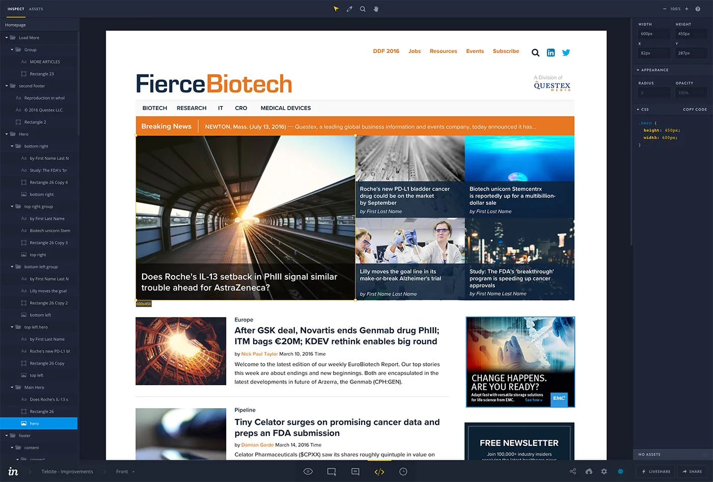
It’s easy to get overwhelmed when trying to solve the issue by assuming software will be the answer. While the right tools certainly helps, it’s the process which makes it all work. I went through and tested all the prototyping software I could find as well as toyed with the idea of delivering front end code, but ultimately landed on a combo of using Sketch and Invision (with the Craft plugin) to help describe what we wanted in production version of our designs. As designers we sometimes assume developers will infer micro states of design elements the same way we do. This is the purpose of design documentation, and something which I haven’t seen worked into many design tools effectively. Invision allows us to specify the sizes and formats of our designs in a non-intrusive and intuitive manner.

The Process
As with all of our products, the initial step is still requirements gathering and conversations with the development team on technical considerations, which result in user flows and mind mapping. The difference early on is we moved our wireframes from Axure over to Sketch, which allows us to sync them to Invision boards. This is what we deliver and present to stakeholders, and allow them to click through and experience the user journey early on. We can see pain points earlier than before, and lock down more of the design quicker. From here we design our UI, again in Sketch then synced to Invision. In this step we make sure to proper export settings for each element, so the development team can grab them directly from Invision’s inspect mode. This is one less request the development team has to reach out to the designers for, and any question on color or sizing should be answered by the Invision board.
What’s Next
Invision has definitely helped communicate our intended experiences in our designs, but there is still a way to go in terms of communicating the interaction methods. Invision’s inspect mode will definitely help with this, but as we try to layer on more complex animations and user interactions, we move closer towards creating the components in CSS and Javascript. That may be the next step, which we are currently testing. Having design deliver a set of built components or at least code examples of the desired interactions. Or at least until the next tool which solves all of this comes along!