News Platform CMS
The challenge was to create a news platform which would be able to serve as a template for multiple brands and iterations. The brands ranged from the hospitality to biotechnology, with a wide array of branding standards and existing features to be migrated.
One of the early brands migrated was FierceBiotech. The process was as follows:
- Requirements gathering and analysis of current site features
- Stakeholder and user input on paint points of current platform
- Translating requirements to a set of goals for the new platform
- Creation of wireframes with buy in from engineering and product owners
- Designing the UI and prototyping interaction methods where necessary
- Communicating design specs to the development team and following up on design comp accuracy in production
The biggest challenge was anticipating the needs of future brands with this platform, both in layout and visual treatments. Using as much of an open layout as possible would allow for various logo treatments, image aspect ratios, and additive components.
Original Design
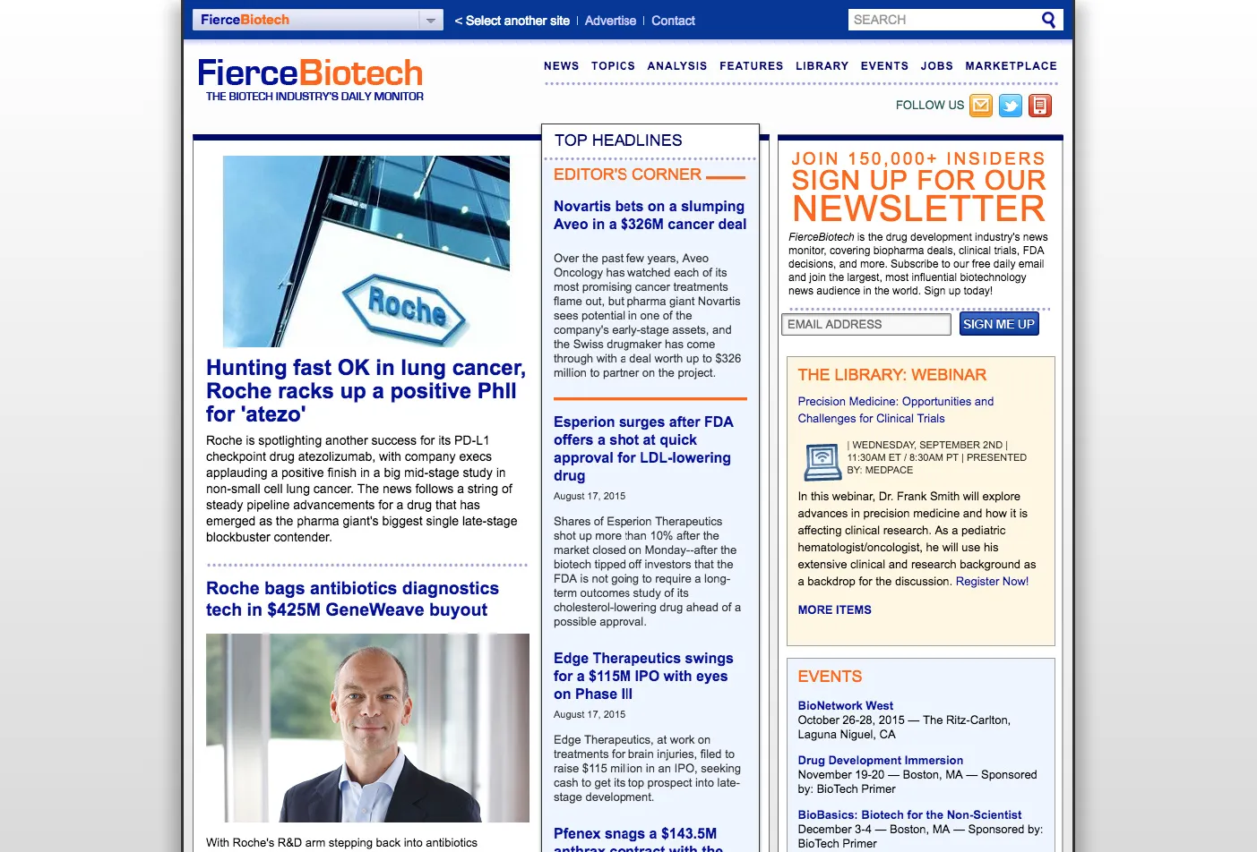
The existing layout was a non-responsive, 960px width site with 3 columns. Alot of information was presented up front with not enough hierarchy and guidance for the user. One of the goals was to clarify the focus on the page and showcase the editorial content.

Wireframes
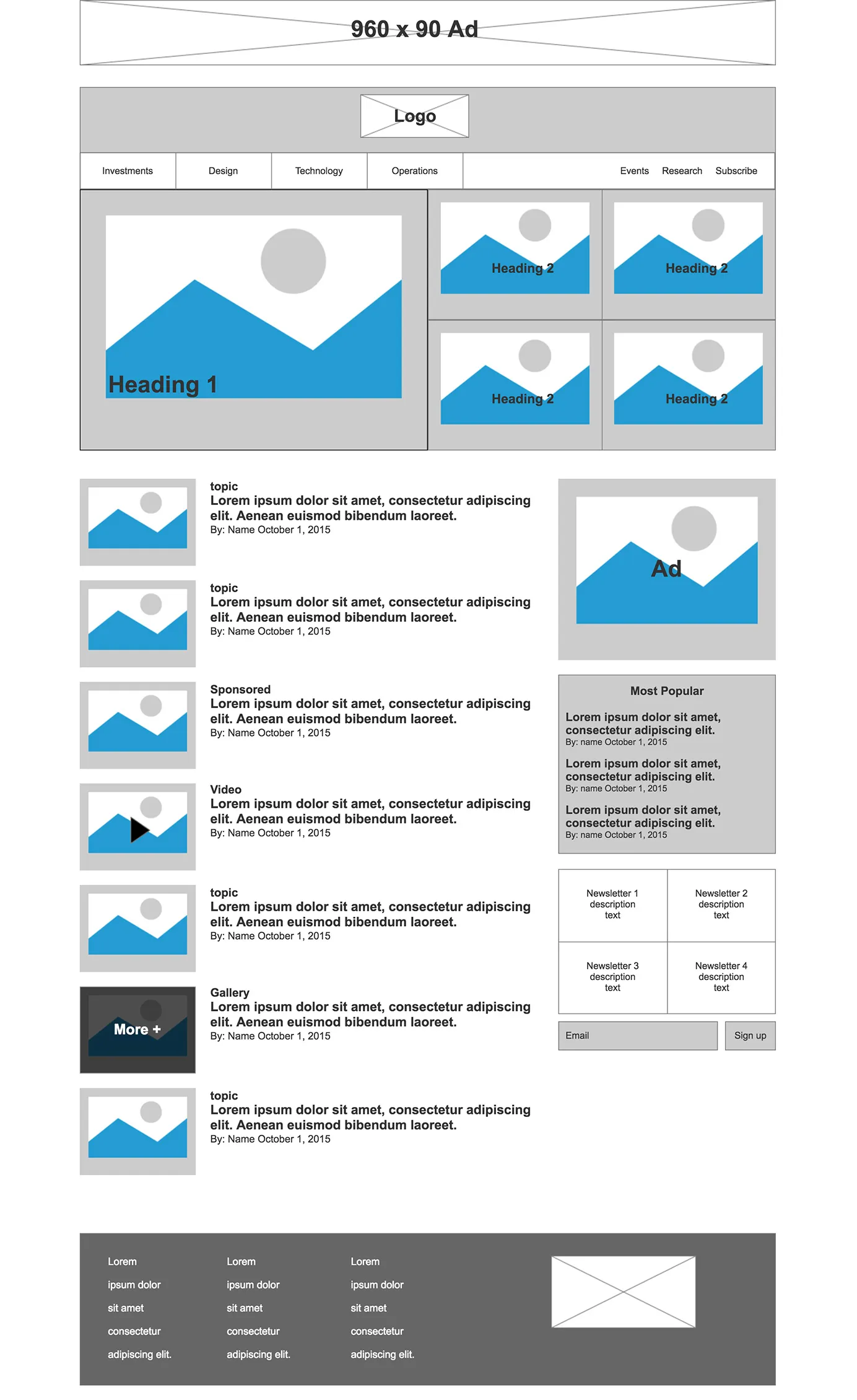
Using Axure to create the wireframes, I prototyped a few solutions based on feedback and came up with the following. A prominent placement for the logo which would allow numerous logo sizes to work. A clear header section distinguishing primary and secondary navigation elements, and below that are featured stories. Sticking to a 2 column layout allows us to put greater emphasis on the content and use the single sidebar as a utility area actionable items such as newsletter signups and most popular content.

Mockups
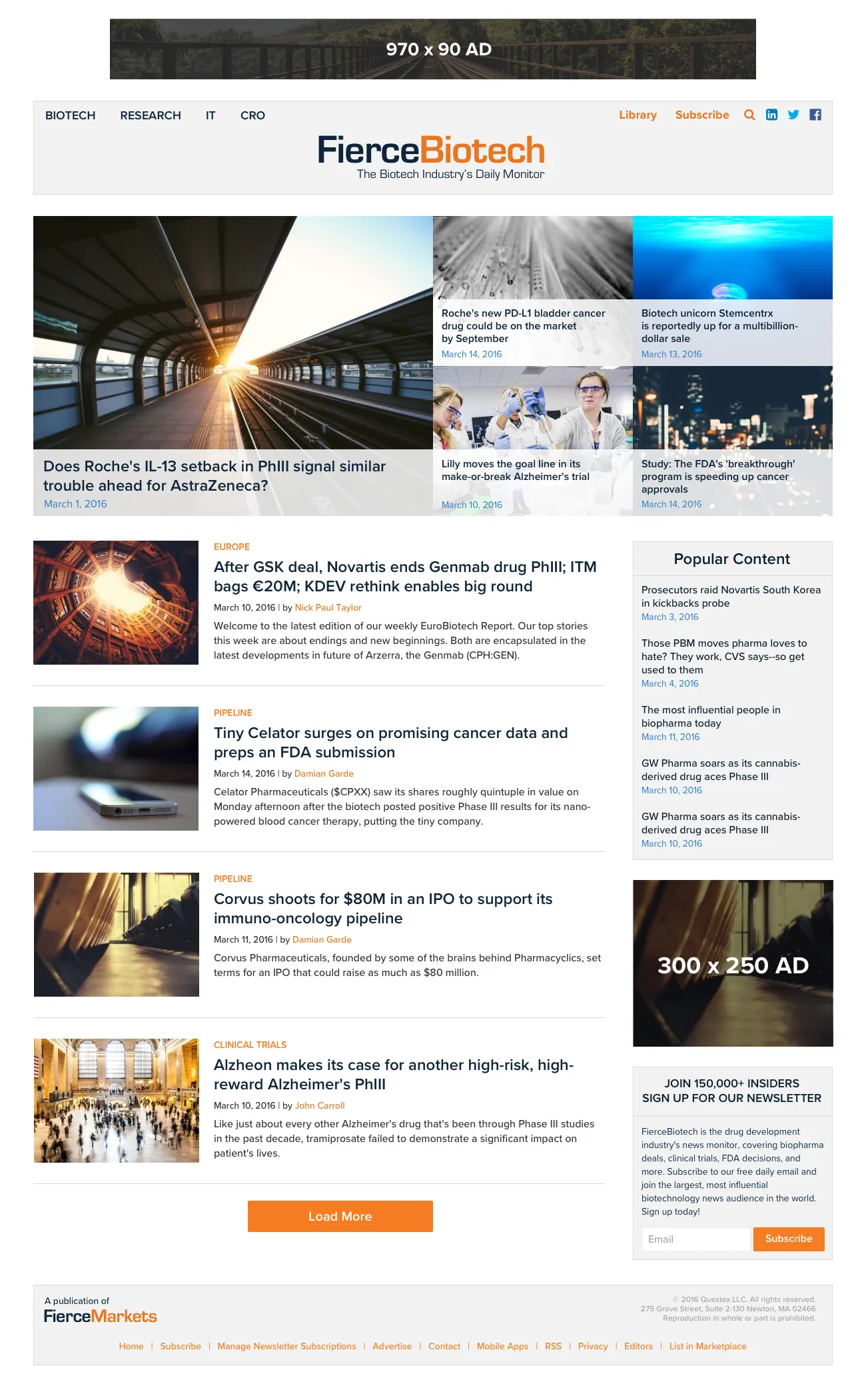
Designing the UI was where the improvements from the original site were more clearly seen. The improved breathing room for the content, more impactful use of imagery and an easier to navigate site. A big part of this step was to extract a style guide from this mockup, which could be easily construed for another brand on the platform and spin up their own news site.

Further Improvements
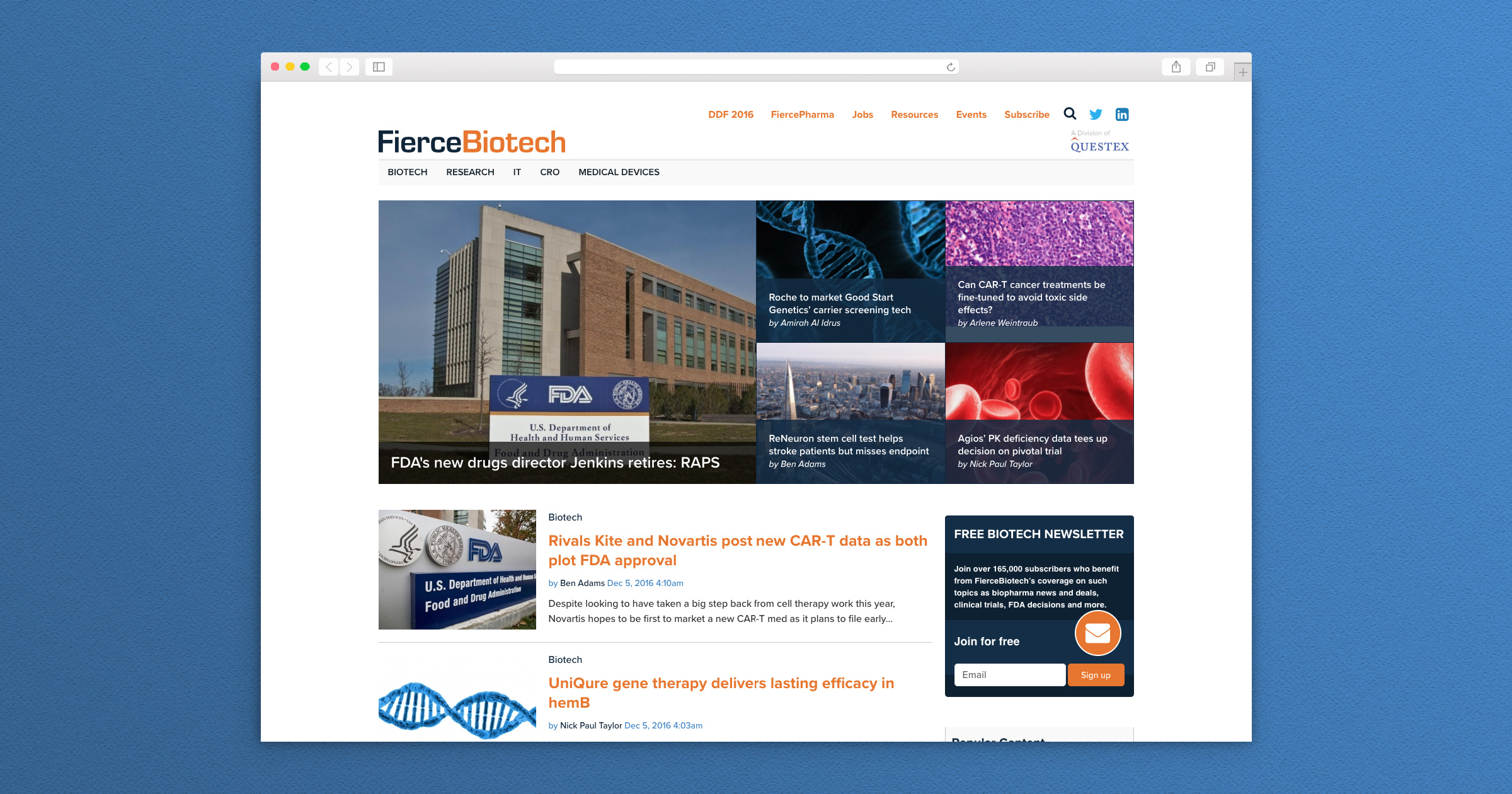
This was the new starting point for this platform. Over time we have continued to improve parts of the site such as the navigation for clearer hierarchy. Some of these improvements are driven by the requirements of new brands we onboard, while others are based off the usability research we continuously do. Keeping the feedback cycle open and tracking usage over time will be the driver of all further developments to this platform. We’ve seen large increases in time on site and engagement, and have gotten great feedback on the improved design of the new platform. One of my other plans is to take the static style guides a step further into a living style guide with interaction methods detailed.