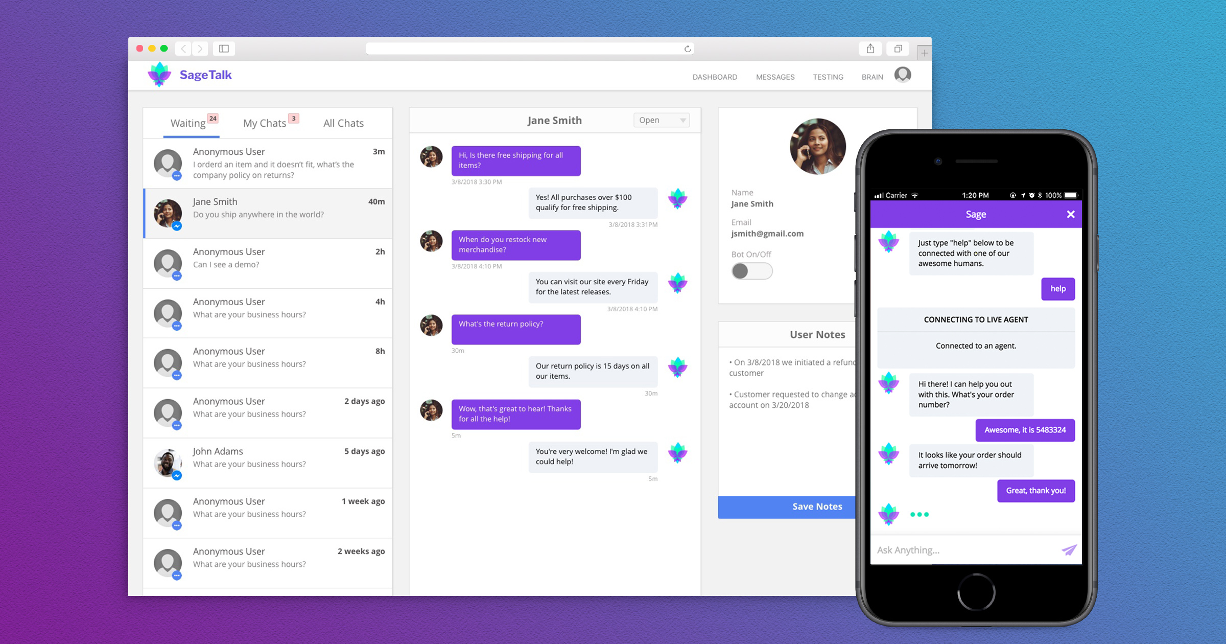
SageAI Live Chat
SageTalk, the first product from SageAI, is a chatbot aimed at reducing the repetitive and simple to answer questions usually fielded by customer service agents. I worked as the lead design engineer on this product, designing all the backend dashboard elements and building out the presentation layer of the React components.
The Challenge
We successfully completed the MVP of the chatbot and continued learning from our customers what features we still needed in order to turn them into repeat customers. One area which kept coming up was the ability to hand off chat sessions from the bot to a live agent within our platform. This is something we previously handled via a contact form or an external third party live chat solution. For the goal of minimizing dependencies and delivering an all-in-one solution to our customers, we focused on building out a live chat feature for the platform.
A lot of the technical considerations were luckily solved by being on an asynchronous stack, Node. So it became a matter of breaking down the specifics of a live chat feature and what could be realistically built in 1 week, as we were prepping for a big demo.
Requirements Finding
Working with the lead backend engineer, we came up with the following list of features.
- Statuses for messages being answered by the bot, waiting for a live person, and assigned to a live agent
- The ability to filter messages based on the defined statuses above
- A notification system for new messages awaiting live agent response
- Adding the ability to assign a message to a live agent and mark it as complete
- Create a place for account notes
- Reorganize the messaging panel to better illustrate outgoing and incoming messages
- Better account for content widths and prevent breaking layouts
Our Approach
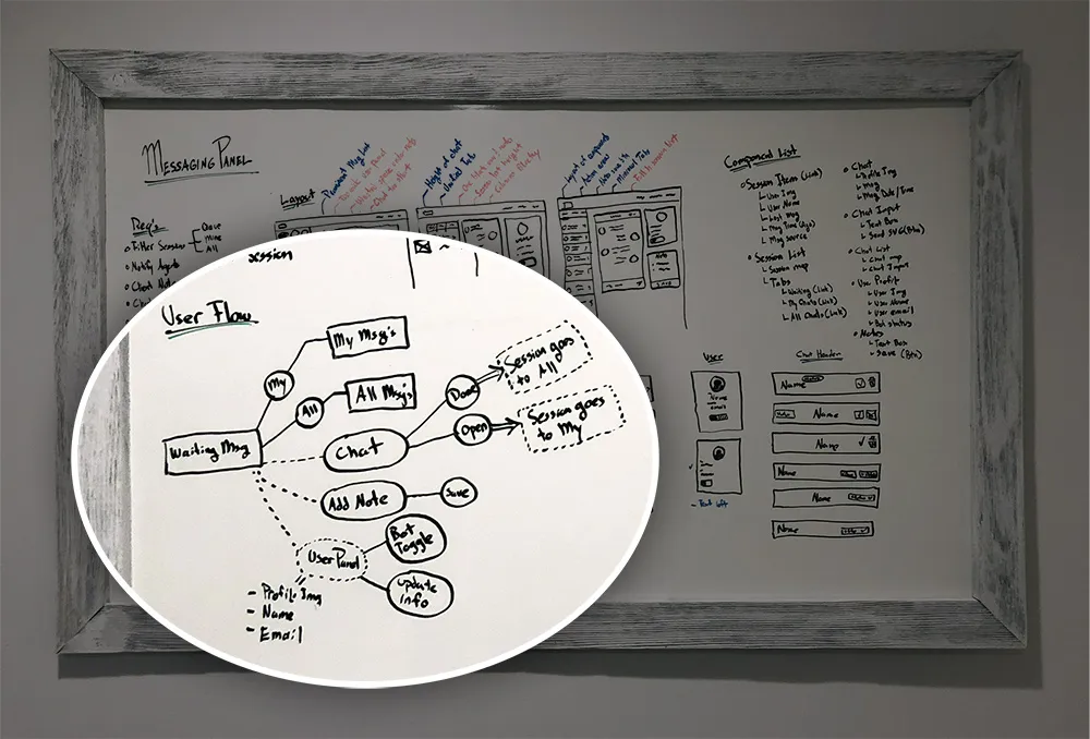
User Flow
I started with sketching the user flow through the possible scenarios and action states. In this single page, a user was able to go to different tabs, take a message in a uni-directional manner through the tab states, reply to customer messages, edit customer account details, and add notes to the customer account. This allowed me to catch any gaps in the logic and account for all states as well as interactions between those states.
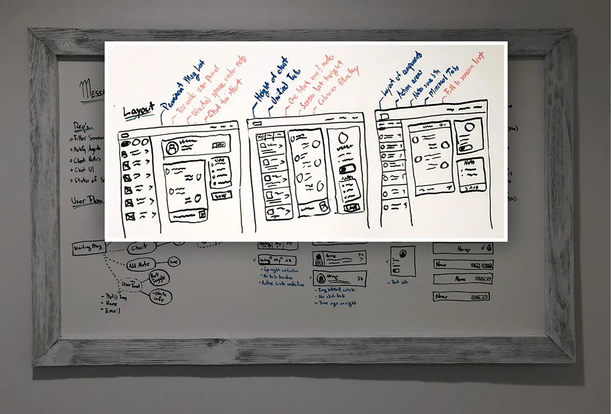
Wireframes
Once I understood what needed to be included in the UI, I worked on some sketches of possible layouts. As I progressively worked through these, I made notes after each iteration on what I believe worked and what didn’t. Doing this by hand I find is a quicker way to go from thought to visual, especially while I’m still in this early ideation stage.
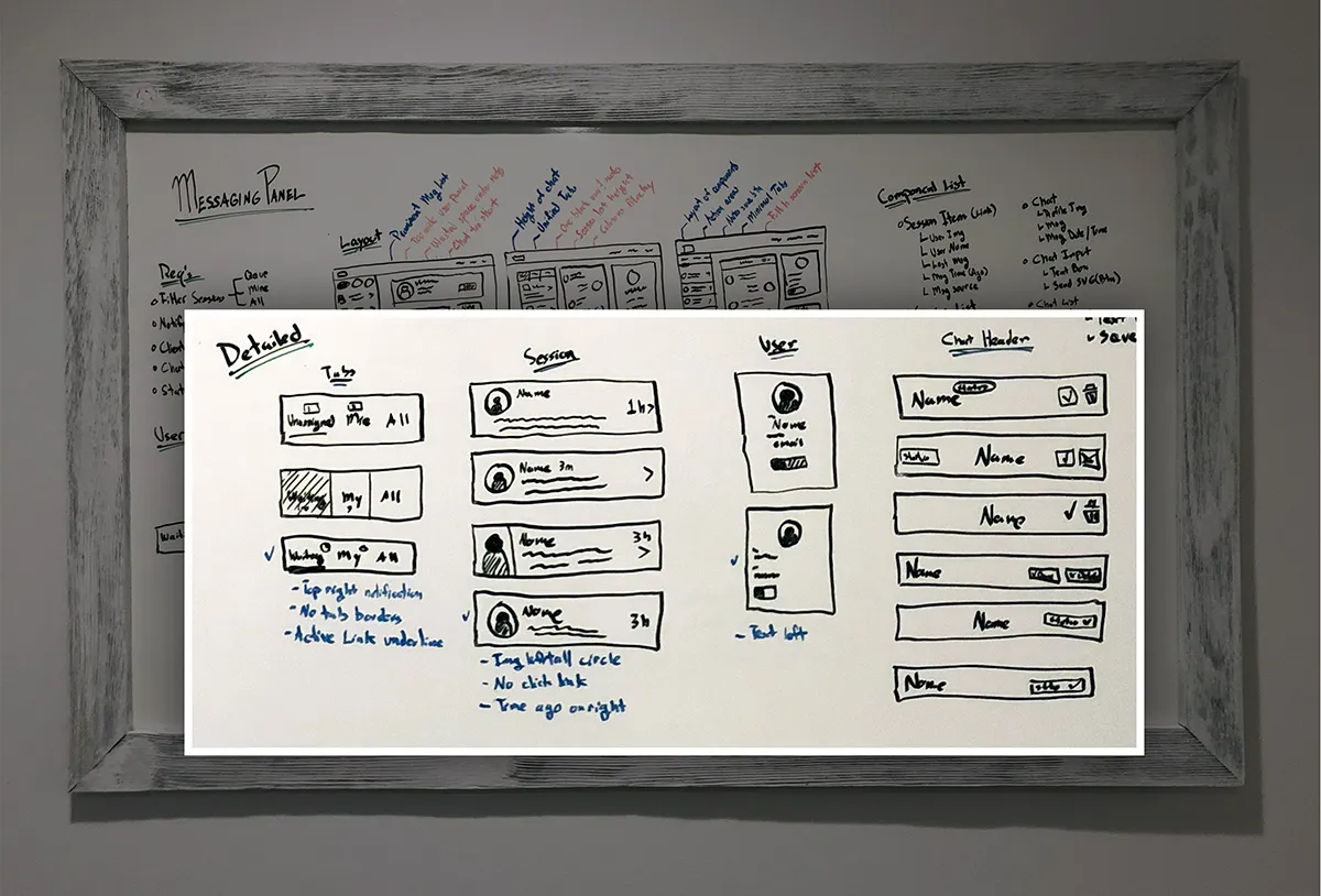
Now that I had a general idea of the layout and where actions and data would go, I iterated on specific components and worked through the design of where each element would go in the components, ensuring I wasn’t leaving any gaps in the expected user experience.
##Production After getting my ideas down on the whiteboard, I moved to Sketch to create higher fidelity mockups of the screen and individual components. I started with a component approach and translated that into Sketch symbols. In addition to framing the design as components, I also tried to keep the layout modular, knowing we were still very early in the process of customer feedback and would have to shift elements around or add to them as we learned what parts worked best based on customer research.
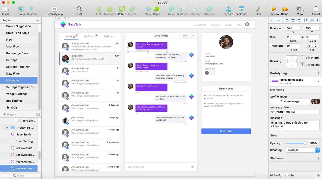
Sketch helps me decide on element size relations and color treatments, I then move to code rather quickly and continue to tweak the design as I get to work with actual data. Since this project is in React, it’s easy to take the individual Sketch symbols and create React components from those. I created all the markup as JSX in the render function and scoped all the CSS to the individual components to start getting an idea as to how the UI will come together. From here I passed through any props needed to the components and handed off the components to the backend engineer to finish the functionality.
Results
In 1 week, the lead backend engineer and I were able to successfully launch version 1 of our live chat platform. We had asynchronous communication between the chatbot and the backend dashboard, the ability for messages to be recognized as in communication with the bot, a human, or complete. As well as the ability for users to change the status of these messages and add notes to customer accounts. All tied together with a cleaned up UI, better structured for the data types.
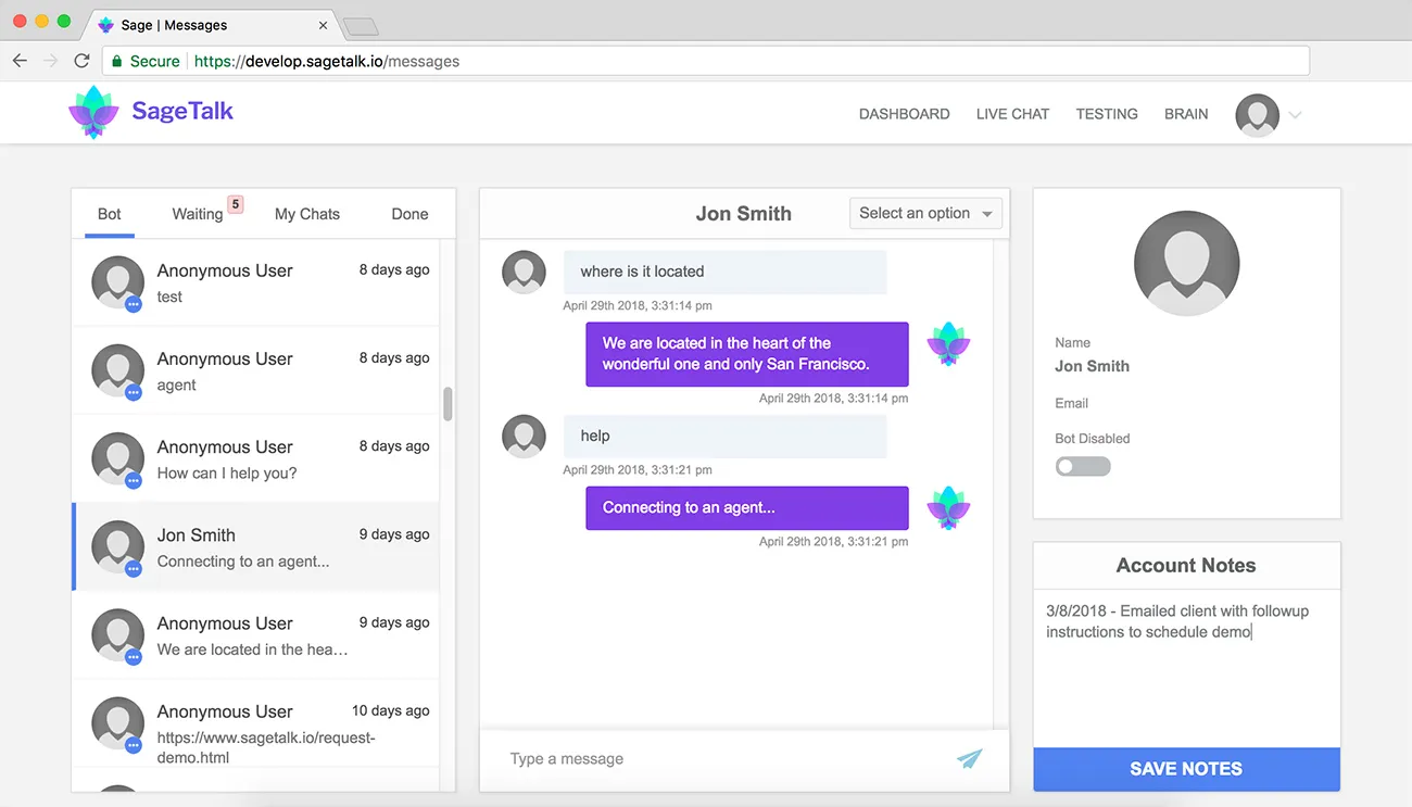
We are currently listening to customer feedback on this rollout, and working on tweaks to automate parts of the UX and adding a more robust notification center to better manage individual chat session notifications. This launch has enabled SageAI to say they are one of the first live chat customer service platforms with an added AI layer.
Takeaways
- Dashboards can be overwhelming, especially ones that require immediate action. Minimizing the interface the distance between related actions is crucial for efficiency.
- There’s a hierarchy for live chat interfaces, from all messages to a single message, to user details. Flowing this from left to right makes for a more intuitive understanding of this.
- Color and font callouts were important for directing user attention in areas with lots going on, such as the red notification for waiting for messages at the top of each tab list.
- The user details area is probably the least used and focused on, and its size in relation to the other areas of the page should reflect this.
- To make it clear the benefit of AI in live chat, we should show what work the system is offloading. We did this by adding a new column before the other tabs, labeled bot. This is where the users can see all the messages they don’t need to reply as the bot is handling them.