Upstream Tech is a technology company harnessing advancements in remote sensing, computer science, and machine learning to provide ecological planning and monitoring services. This is facilitated through a web application that combines satellite imagery, layers of vector data, and machine learning insights. I worked as the sole Product Designer and contributed front-end code to the React application as well.
The Challenge
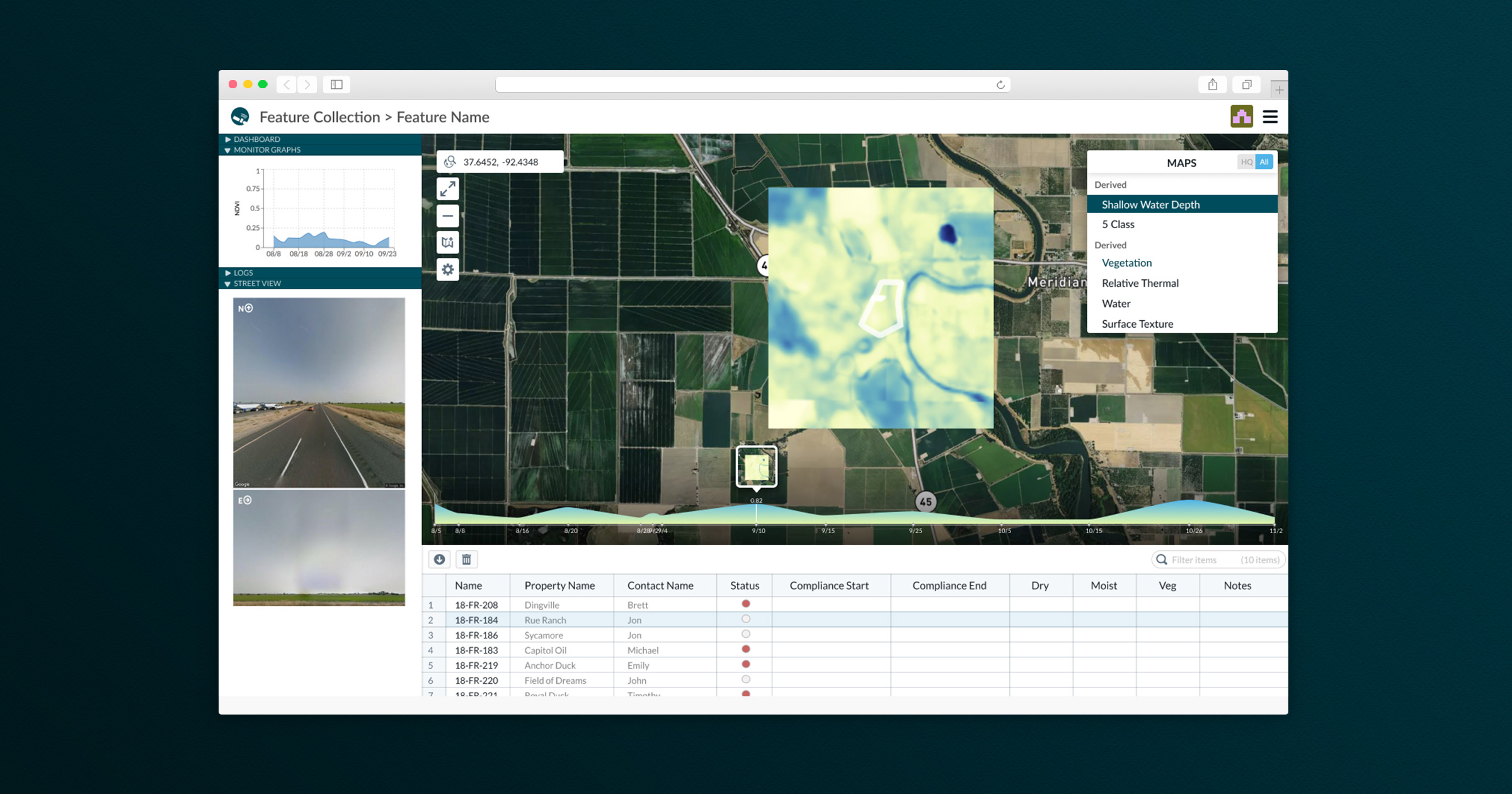
In speaking with our customers we kept hearing a paint point around users wanting to manage their vector layers of data in the application. When previously viewing their project in the application, the user would see a single layer of the outline of the land they were interested in. We knew users wanted to see additional layers of data, but questions remained around what the structure of this data looked like, how much of it they wanted to upload, and what they wanted to do with it once it was uploaded.
The Approach
Working with our business development team, we were able to schedule calls with current clients to understand the specific user story around this request. As land managers, they wanted to add additional layers of vector data, so that they could see where geographically these layers overlapped. And the related metadata associated with each of the layers to better identify what was happening and permissible in these areas. From this story, we derived the following features as necessary to test our solution.
- A user should be able to upload their vector data
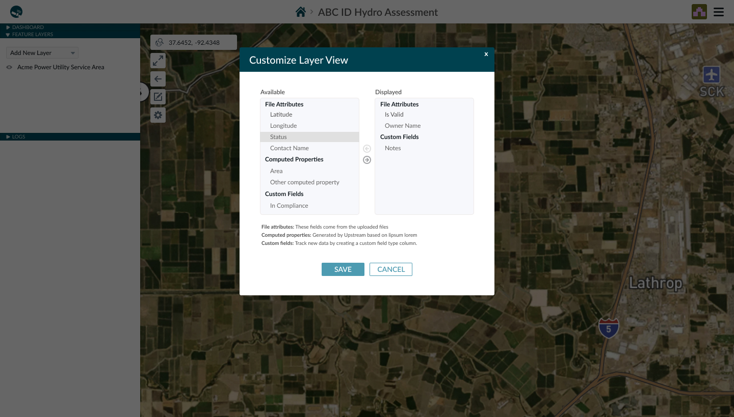
- Each uploaded layer contains metadata, a user should be able to specify which is important
- Once the layers are in the application, a user should be able to decide how many layers they want to see at a given time
The Approach
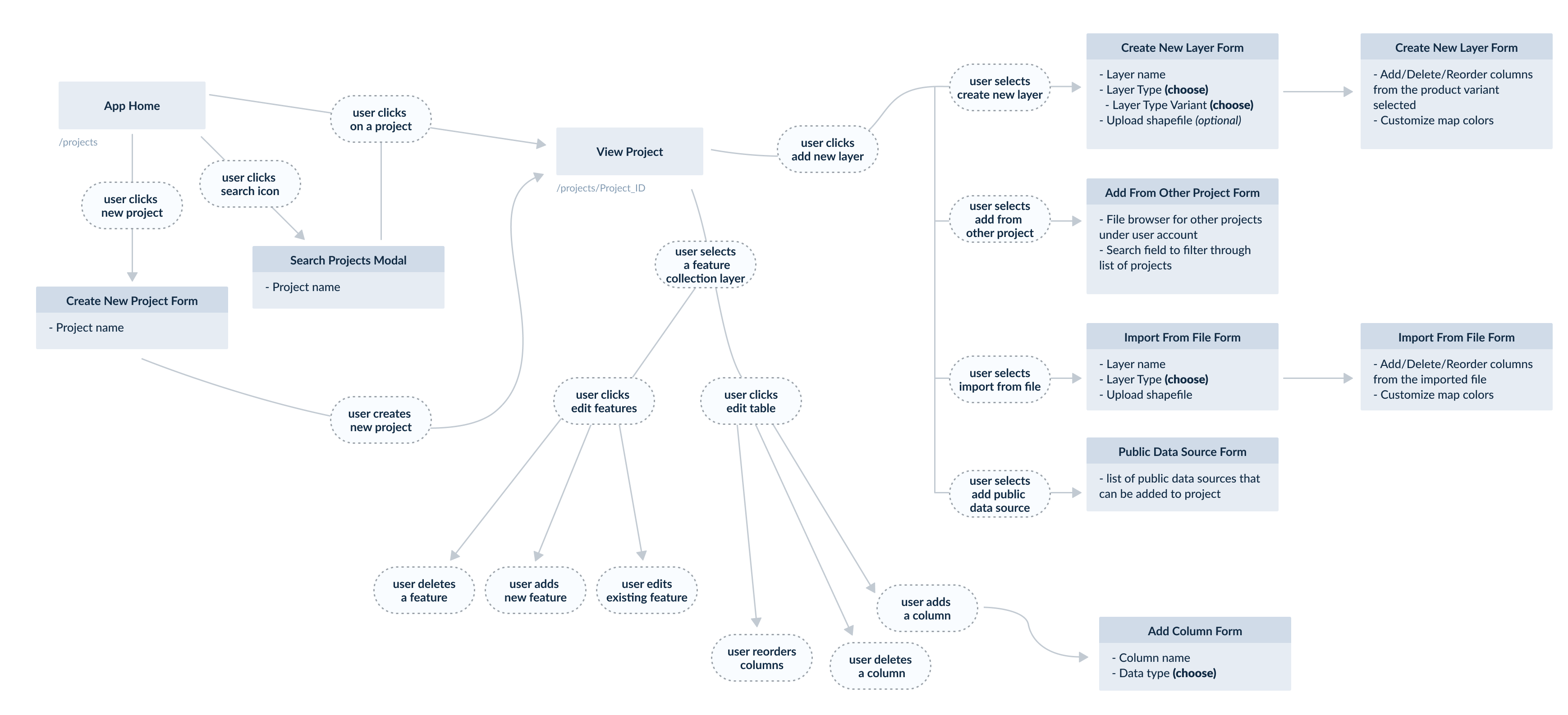
User Flow
Once I had the requirements and the associated user story to guide me, I created a user flow to ensure my vision for the user experience aligned with the expectations of other internal stakeholders. This also served as a guide for the UI development and laid the groundwork for the data structure necessary in these new custom layer types.
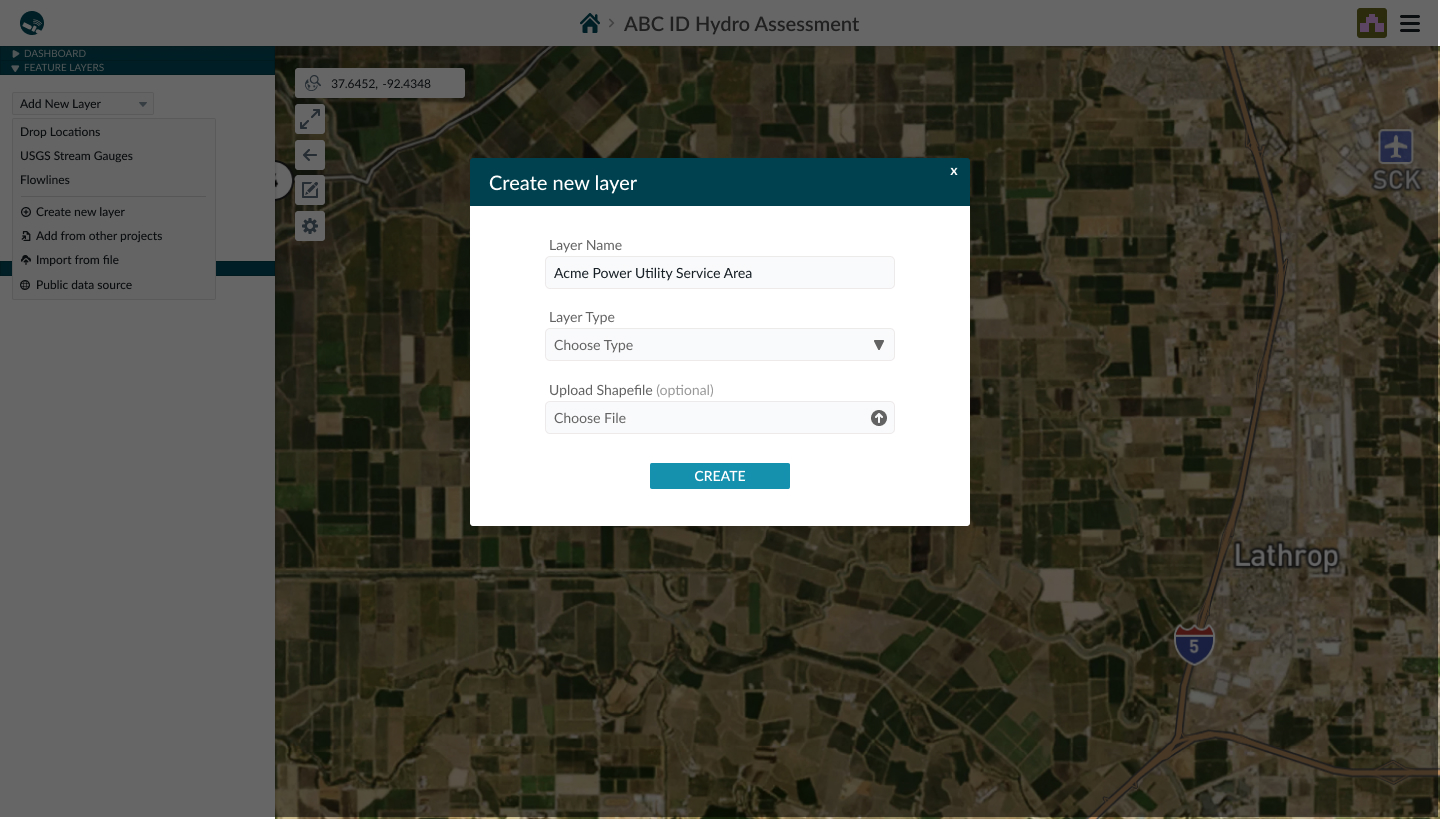
High-Fidelity Designs
After the user flow was agreed upon by both business development and engineering team members, I designed the UI of this feature. Since we had the established styles of the application, it was easier and more time-efficient to go straight to high-fidelity mockups. Once the designs were established, the engineering team was able to quickly implement, and we delivered this feature within a couple of weeks.
Results & Learnings
Upon onboarding users to the new features and getting initial feedback we realized the value of the feature was in the ability to associate the overlapping geographical areas with the land boundaries, and separately to see the metadata from these custom layers. The takeaway here is that these two pieces of data aren't as connected as we originally thought, and could be independently surfaced in the UI in a more helpful context. Some other lessons learned were:
- The metadata that is important greatly varies from one custom layer to the next. So focusing on a mechanism to easily manage the metadata and customize what is extracted from that is important.
- It can be overwhelming to see multiple layers of shapes on top of each other, and it may not be enough to simply turn them on and off. For example, you may want to reduce the opacity of a layer to reflect the actual importance of the data in that layer.
- The metadata extracted is valuable add-on information to the user project, it helps frame what they are looking at. Whereas these custom layers are more action-oriented and help deliver the unique value of the platform.